How To Design A User Engagement Dashboard For Mobile App
Every UI designer wants to engage their userbase. That's the whole point of a website or mobile app: to provide something of value that gets visitors excited and interactive. But it's almost impossible to gauge engagement unless you're actually watching a user interact with your website. Thankfully, there are clues and metrics that can be used to infer user engagement.
This post will cover how these metrics work, and why they imply greater engagement from users. I'll also share tips and strategies you can apply for testing improvements in these metrics over time.
Engagement Metrics
Analytics programs can help you track data from all users on your site. The difficulty is understanding these metrics, what causes them, and how to improve them.
Google looks at certain page metrics for engagement to see if users actually find what they're looking for on your site. This is not only important for SEO, but also for creating a genuine user experience.
Many will argue that a page's SERP click through rate and social shares are part of engagement tracking. This may be true, but they're more about off-site concepts rather than on-page engagement.
The metrics you can improve by altering your design are the ones I'm focusing on. Here are some to keep in mind:
- Time on page
- Pages per visit
- Bounce rate
- Returning visitor percentage (how many repeat visitors?)
- Returning visitor frequency (how often?)
All of these metrics indicate user engagement, meaning that if bounce rates are low and pages per visit hovers around 2+ then people are generally digging deeper into the site. However this example means very different engagement styles based on the type of the site.
Different User Strategies
Blogs engage their readers differently than YouTube channels, and both of them engage people differently than SaaS web apps. The first thing to remember is that each website has users that behave differently based on the content.
If you want to improve engagement for user signups, make it a simpler process. Try adding a signup form to the home page like Code Academy.

Alternatively, product creators might use free products to encourage potential customers with the quality of their freemium content. This technique is used on the home pages of Ctrl+Paint and Proko, both specializing in video tutorials for aspiring artists.

Engagement metrics for these sites might be the total number of monthly signups or purchases. But their site managers also might check the total number of page views on specific pages (like product preview pages or FAQ/info pages).
Think about what you want users to do before you attempt to improve the engagement process. This can give you a blueprint to follow when looking for greater interactivity.
Content Engagement on Blogs
The web was initially made as a medium for sharing and consuming content. This is still true today, and the amount of content online has never been greater. But how do you write content that encourages visitors to stay and consume? Here's a great post talking about small strategies that do seem to pay off.
Shorter Paragraphs for Easier Content Consumption
One of the recommendations is to write shorter paragraphs so that readers feel like they're accomplishing more with each sentence. Visitors must scroll to read more, and this offers a feeling of easier consumption compared to big blocks of text.
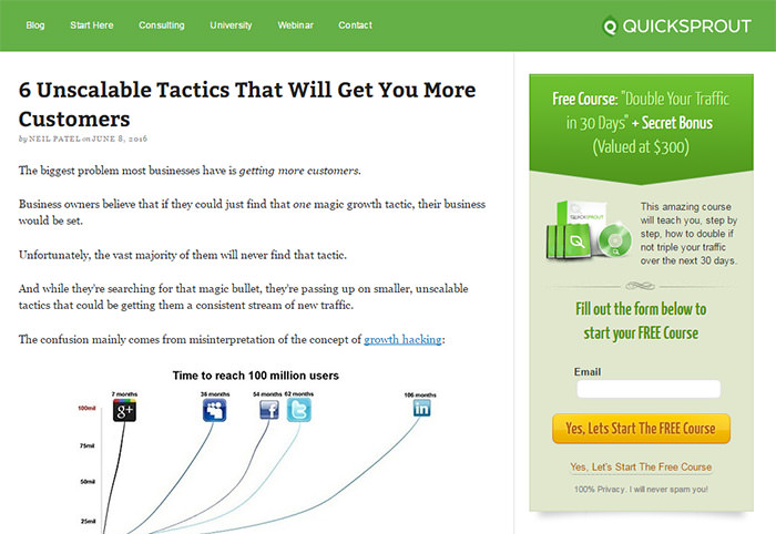
Neil Patel's Quick Sprout blog uses this short paragraph method, and it works beautifully.

Related Stories for More Page Views
A method to increase page views is to offer related stories, popular stories, or recent stories in the sidebar & after each post.
This works the best with post thumbnails, as images capture attention quicker than words.
TechCrunch has mastered this technique with related posts in both sidebars, listed after the post content, and sometimes even within the post itself.

Brand Building for Better Visitor Retention
People who find content through Google usually bounce, because they were just looking for some information. Many people just browse blogs they randomly find in Google, but that doesn't mean the content is bad.
So how do you increase visitor retention on a blog? The natural answer is to build a brand that people trust. Blogs eventually become authorities when they publish enough great content to keep people visiting every single day.
Two great examples of recent successes are Pinch of Yum and WP Beginner. These brands are incredibly popular in their respective niches, and the domains are seen as true authorities.

If you wish to reach this level of an authority blogger you need to just keep writing. A brand takes time to build, but great content and consistent publishing will expedite the process. When you notice a large amount of repeat visitors on your blog every month, you know you're on the right track.
Customer Engagement on Product Websites
As mentioned in this blog post by Popcorn Metrics, one of the easiest metrics for product websites is the total number of active users. This is the total number of unique users who have logged into the site or performed an action (like updated their profile) in a set period of time.
Improving this metric can be tough without UX research and A/B testing. Here are some great engagement tips for product websites, such as in-app messages and feature announcements within the dashboard.
Ask Your Customers for Feedback
The best tip is to interact with users, and gauge their feedback along the way. What do they really want? Are there any current features that seem annoying, unnecessary, or overly convoluted? You can't always reply these questions solely by studying metrics, so you may want to reach out to users for input.
Create a Cycle of Growth
Think about sites like Stack Overflow and Quora where the product isn't only for members, but also for anonymous public visitors. A Quora user actually brings up this point in a related question stating that the purpose of a product will greatly define the nature of user engagement.
Products like Quora deal with a mixture of readers and members. The content is user-generated, so more engagement from both sides creates a cycle of growth.

Study the Sales Funnel
Products that rely on customers need to study the entire sales funnel. How many people are signing up for trials but not paying? Reach out to these customers and ask for personal feedback. You'd be surprised how many people are willing to share.
Pay Attention to Usability
Quality landing pages and signup funnels aren't always enough though. Your actual product needs to be usable and serve a purpose, too.
For example, Feedly is a decent RSS reader in terms of features, but not in terms of user experience (in my opinion). I've always found the layout to be confusing and unintuitive. Adding a new feed is surprisingly difficult for a web app that's dedicated to RSS feeds.

Conduct User Research
The only way to solve usability problems like Feedly's would be to study user behaviors with custom feedback from each participant. User researches are very detailed, and don't necessarily have to be expensive. However they will provide invaluable information for improving user engagement, and often pointing out the little details that you have never even considered.
Taking Steps Forward
Everything you need to know about engagement can be learned by studying your userbase. Think about what you want them to do, and how you want them to do it. From there, it becomes easier to alter page elements in order to change color, size, position, and web copy.
Metrics can help you see a part of the picture, and to gauge where you're at right now. But moving forward you'll want to understand how users behave and how you want them to behave. Customer feedback and A/B testing will provide the best results.
If you're still not sure where to start, check out these posts for more ideas.
- 8 Ways to Significantly Increase Blog Engagement
- 15 Very Effective Methods To Get Quality Customer Feedback
- High-Converting Places to Add Email Sign-Up Forms to Build Your List
How To Design A User Engagement Dashboard For Mobile App
Source: https://www.hongkiat.com/blog/improve-user-engagement-metrics/
Posted by: walravenvoymaiden.blogspot.com

0 Response to "How To Design A User Engagement Dashboard For Mobile App"
Post a Comment